Frames
Brand OS

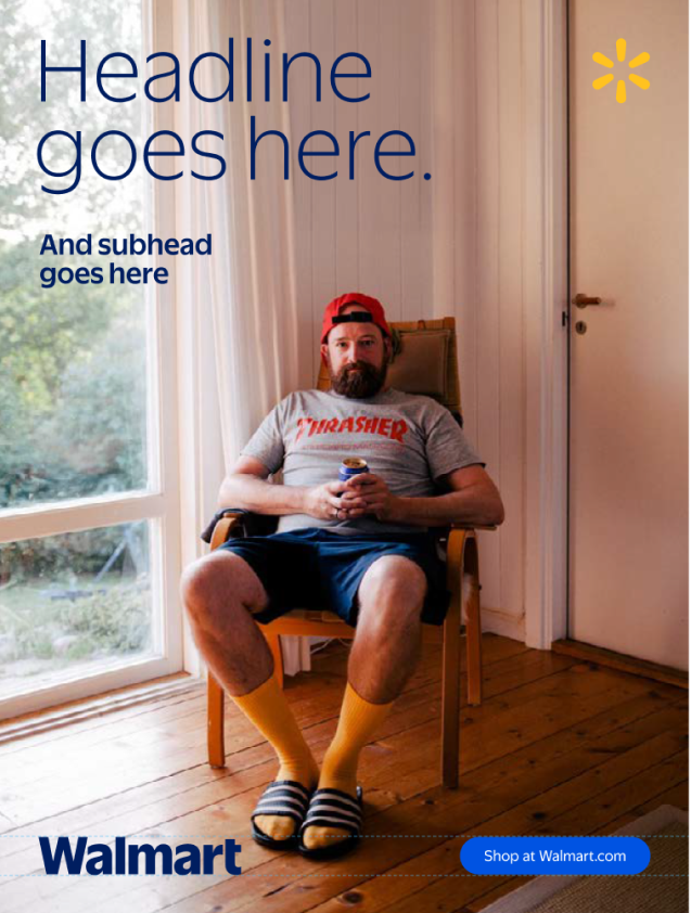
Our frames are flexible and versatile containers that mimic the look and behavior of digital tiles in a user interface.
They help focus attention on a key product or headline, or to organize multiple images into a single layout.
Ground Rules for Frame Usage
Our frames are powerful, flexible tools that can easily be overused and abused. With great power comes great responsibility!
Whenever you’re working with frames, please remember three key points:
1
Less is more.
Avoid the impulse to overuse frames. Keep the number of frames per layout to a minimum. One skillfully executed frame is more powerful than three competing ones.
2
Don't decorate.
Frames are functional tools that exist to direct the viewers’ eye to a particular focal area or to thoughtfully tell a visual story. Don’t add unnecessary frames as aesthetic fillers.
3
Keep it clean.
Alignment and spacing between frames should be neat, uniform, and intentional. Do not approach frames with a collage mentality.
Frame Notes
Corner Radius
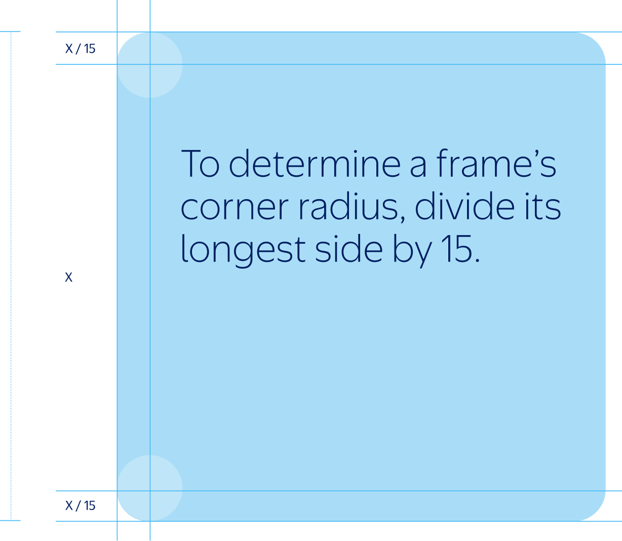
To determine the corner radius of a frame, divide its longest side by 15. This allows corners to scale proportionately across applications. Depending on the size and dimensions of your frame, this initial measurement may need to be adjusted for optical correctness.
When using multiple frames in a single layout, all corner radii should match the average radius measurement—not the smallest, not the largest.
For standard 1920x1080 presentations, we always use a predetermined corner radius of 30px.
Frame Notes
Outline Weight
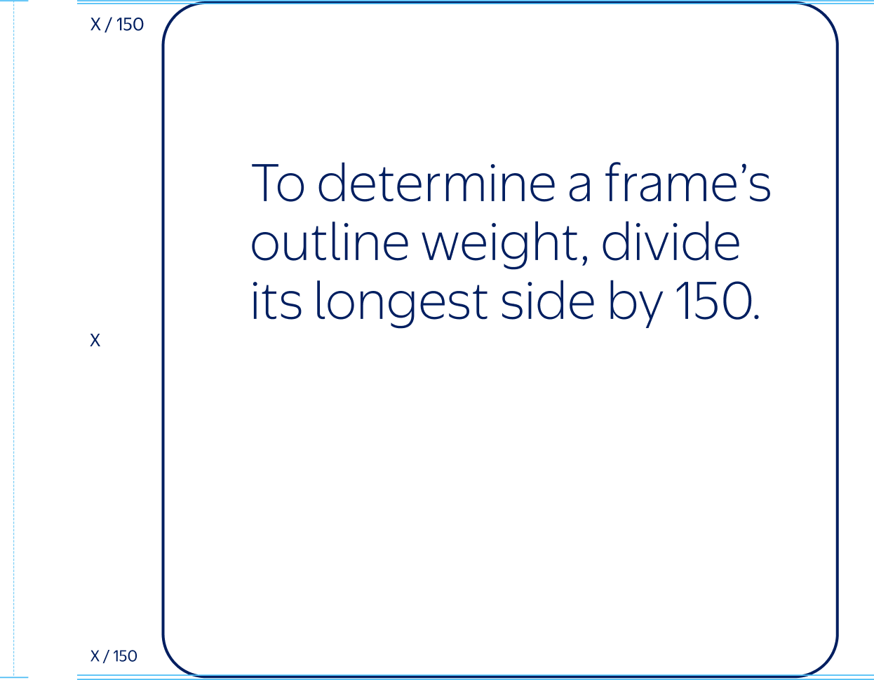
To determine the correct outline weight for a frame, divide its longest side by 150. Depending on the size and proportion of your frame, this number may need to be adjusted for optical correctness.
For standard 1920x1080 presentations, we always use a predetermined stroke weight of 1pt.
Optical Guide
After establishing a corner radius using our formula, check for optical correctness using the examples shown here. If your radius is too large or too small, adjust accordingly.
Too Small
Just Right
Too Large
Optical Guide
After establishing a corner radius using our formula, check for optical correctness using the examples shown here. If your radius is too large or too small, adjust accordingly.
Too Thin
Just Right
Too Thick
Frame Behaviors
Our frames are designed to interact with photography and footage by embodying three distinct behaviors:

1
Windows holds photography or footage.
2
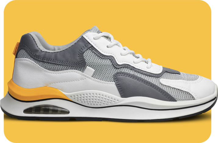
Tiles helps ground isolated products.

3
Outlines emphasize a focal point.
Window
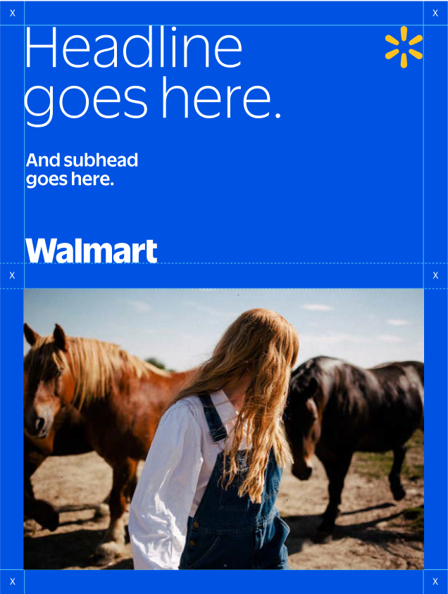
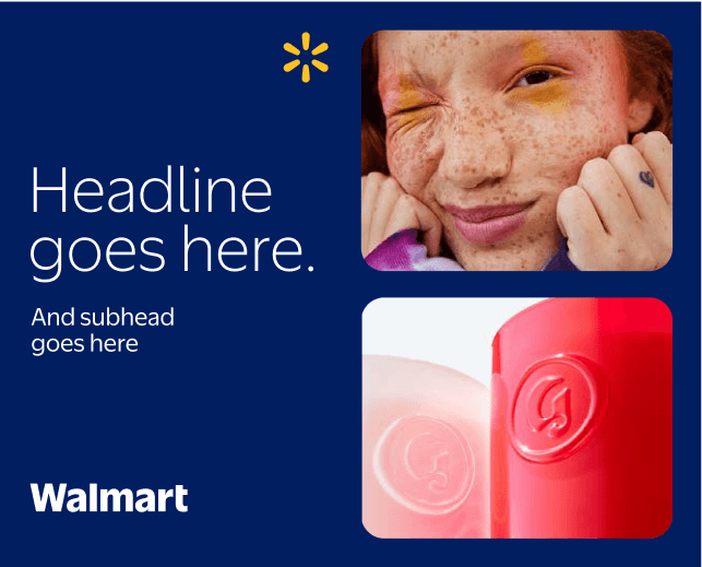
We use windows to hold photography and footage. A max of three windows can be used per static layout to keep our message concise and avoid overcrowding. Images should be assembled with a common theme or message.
Align our windows neatly to our grid. Wherever possible, they should stretch the full height or width between our margins.
1
Always leave clear space equal to our margin between frames and surrounding content.
2
Windows may bleed off one or two edges to mimic a scrolling motion. Edges must be on opposite sides.
3
Up to three windows may be used in a single static layout—no more.
1
2

3
Window Tips
When using windows in layout, always follow these tips for consistent application:
Alignment
Do align windows into neat, tidy blocks that occupy the full width or height of a layout.
Don't apply frames in a way that feels haphazard, scattered, or misaligned.
Cropping
Do crop windows off opposite edges of a layout to mimic scrolling or swiping.
Don't crop windows off adjacent layout edges.
Tiles
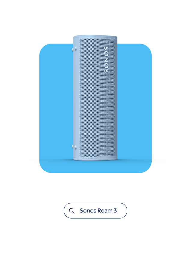
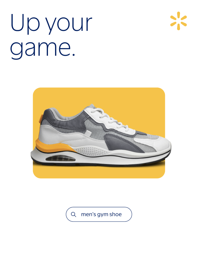
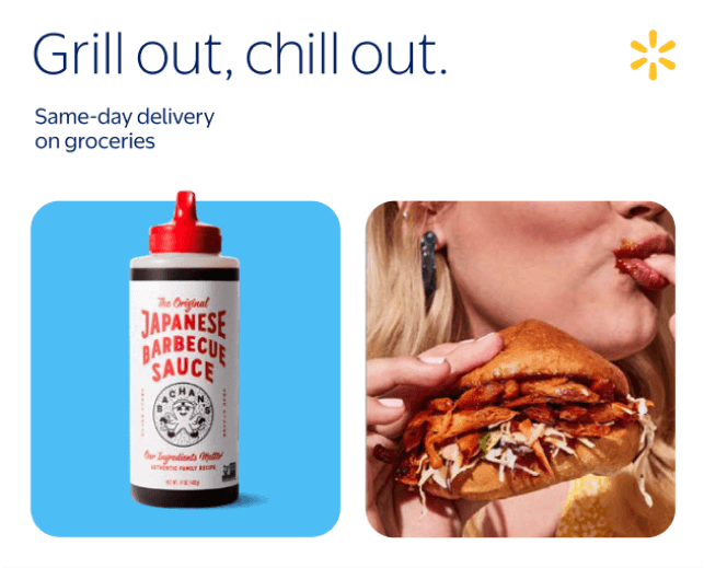
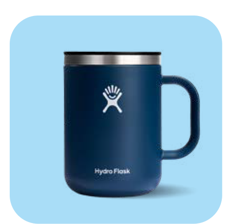
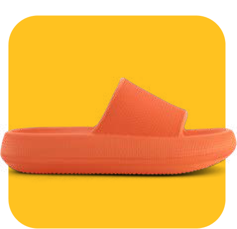
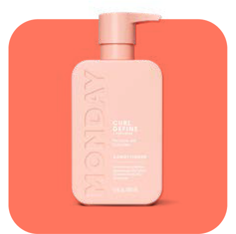
Tiles mimic the aesthetic and behavior of a digital shopping experience. Up to five tiles can be used per static asset if they are neatly aligned and uniform in size. More tiles can be used in motion.
Tiles are applied over White backgrounds, to feel more digitally-native while allowing for wide variety of tile colors.
1
Tiles may float in the center of a layout when featuring a single product.
2
Up to five tiles may be used in a single static layout—keep them tidy and uniform in size.
3
A single tile may be combined with a single window, where appropriate.
1
2

3
Tiles Tips
When using tiles in layout, follow these tips for consistent application:
1
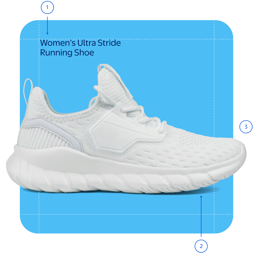
A product name or price can be set inside a tile, aligned to an interior corner. Leave generous padding, roughly equal to the margin of the layout. Text must be in Bentonville Blue or White.
2
Products are shot straight-on or overhead, resting on (or floating above) a surface. Always include natural shadows for grounding and depth.
3
A product may extend past the edge of its tile, where appropriate. Products should occupy the same visual space, regardless of actual size.
4
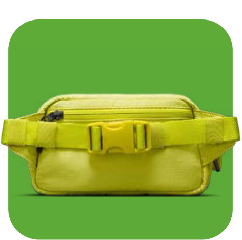
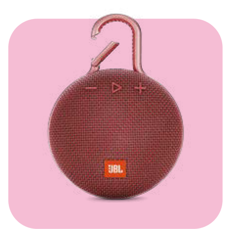
Choose tile colors to complement products or to represent specific seasonal moments. Maintain sufficient contrast between a product and its background.
Evergreen Colors
These are our preferred tile colors, used regardless of season or category.


Seasonal Colors
Example Only
For a moment like “Mother’s Day”, choose tile colors from that occasion’s specified seasonal palette.

Outlines
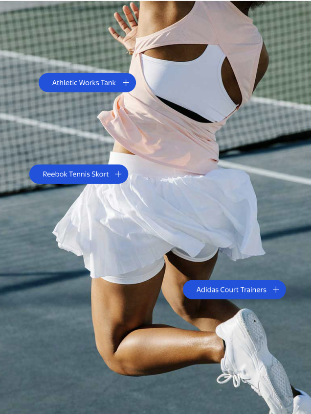
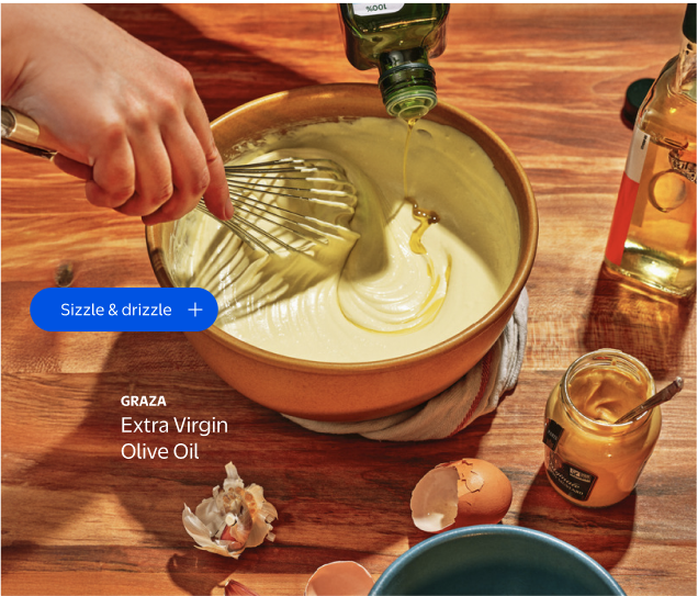
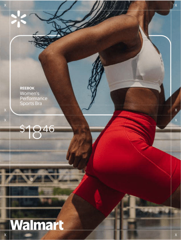
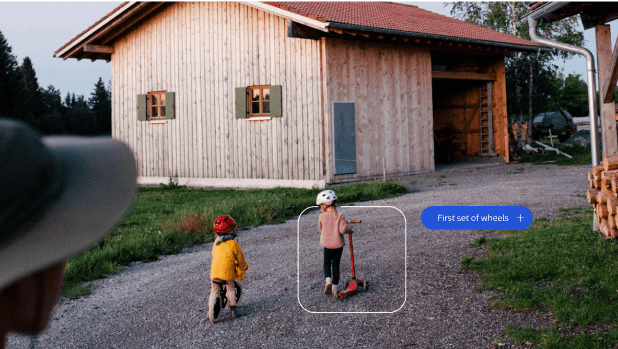
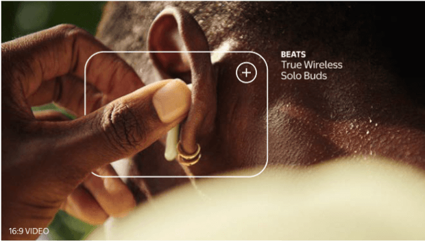
Outlines are used over lifestyle photography or footage to focus attention on a key product or moment. Only one outline may be used per layout. They can't be applied with other frames or frame behaviors.
Outlines are particularly effective in motion, as shown in examples 2 and 3. They are often used with price lockups, product names, or buttons.
1
When aligning text to an outline, always leave clear space equal to our margin.
2
Outlines may be flexibly positioned to best highlight product within a scene.
3
An outline may interact with the subject of its focus, for added depth and dynamism.
1
2
3
Outline Tips
When using outlines in layout, always follow these tips for consistent application:
Color

Do apply frames in White or Bentonville Blue to match text.
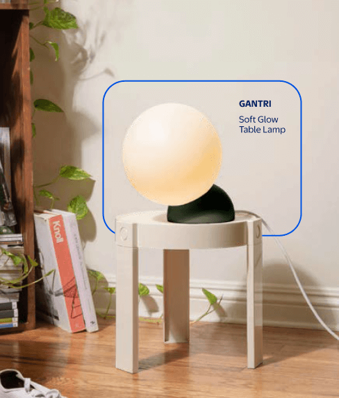
Don't apply frames in any other colors.
Interaction

Do allow frames to interact with subjects or products

Don't awkwardly overlap subjects or products, especially faces.
Frame Don’ts

Don't apply frames within other frames.

Don't collage or overlap frames.

Don't use multiple outlines per layout.

Don't mix all out frame styles together.
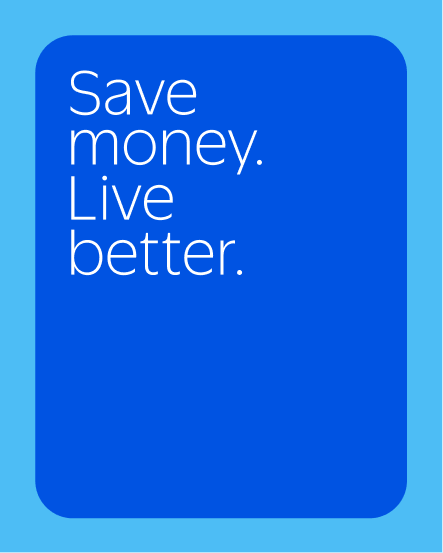
Don't use solid frames as decorative elements behind text or headlines.

Don't use solid frames behind product in lifestyle imagery or footage.
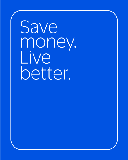
Don't use outlines as decorative elements around text or headlines.

Don't use outlines in any color other than Bentoville Blue or White.
Styling
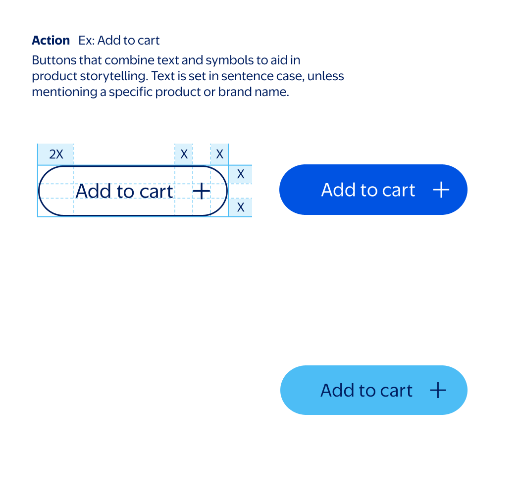
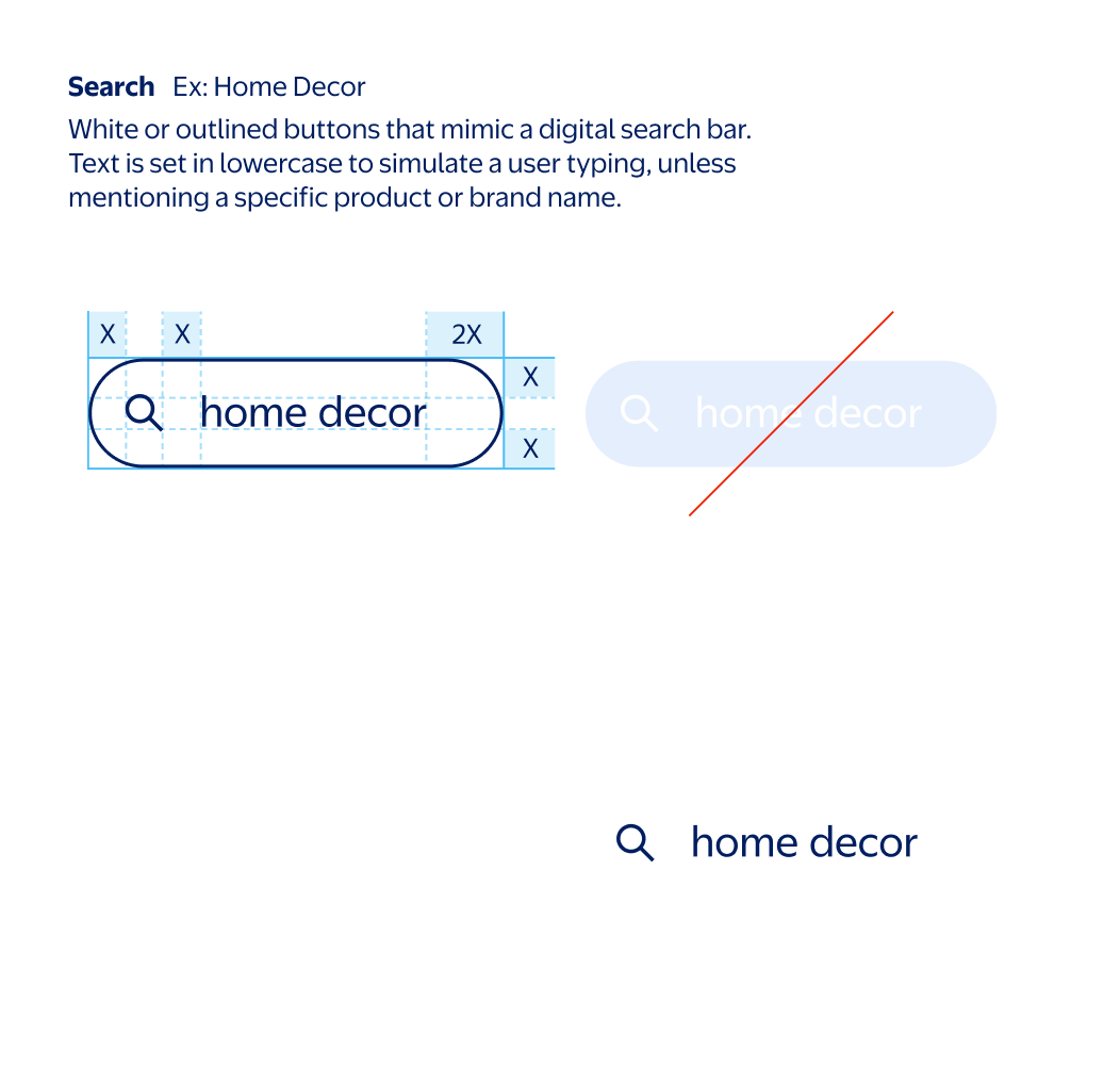
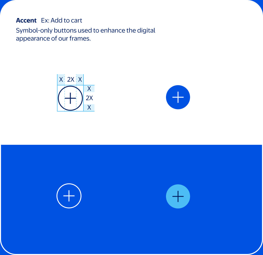
Our buttons are pill-shaped with fully rounded ends, appearing in both outlined and solid formats. Outline weight should optically match the weight of our type (set in Everyday Sans Regular) and any symbols included (magnifying glass, plus sign, etc).
These are our default colorways, which prioritize True Blue for solid buttons. Over True Blue backgrounds, Everyday Blue buttons can be used. Our search bar is the only button that may appear in solid white to reflect familiar UI cues.
Note
This is not an exhaustive list of all possible buttons. Additional buttons can be created within each category, provided they follow these styling rules.
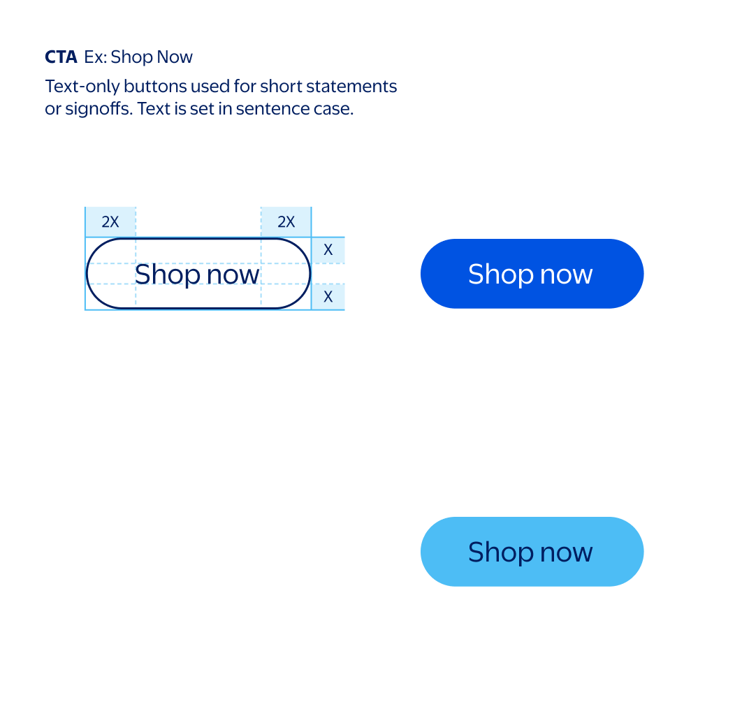
Don't use rectangular buttons.
Don't recolor solid search buttons to any colors other than white.
Don't recolor outlined buttons to any colors other than Bentonville Blue or white.
Don't set button text in bold or all-caps.
Don’t use buttons in solid white aside from our search buttons.
Don't mismatch weight of outline and symbol.
Don't make an accent button larger than its frame's corner radius.
Don't make an accent button smaller than its frame's corner radius.
Don't recolor outlined accent buttons.
