Grids
Layout

Our grid is how we assemble our brand elements into a whole.
Whether we’re making a detailed multi-page presentation or a simple email, we always use the grid as our starting point.
Margins
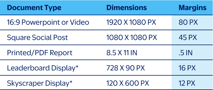
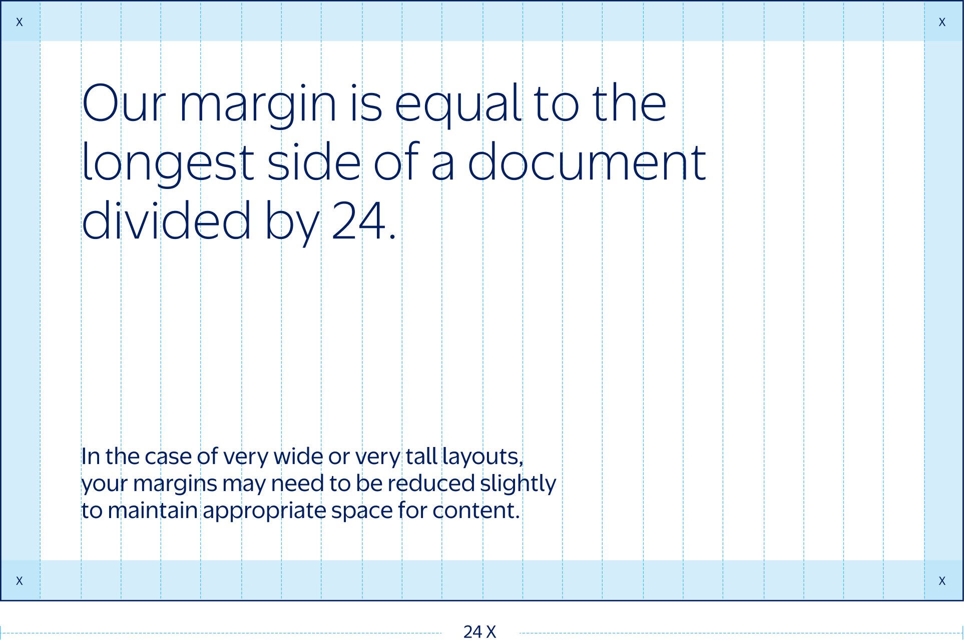
Margins establish a consistent foundation, ensuring content remains legible, uniform, and tidy. Our standard margin width is determined by dividing the document's longest side into 24 equal segments, with the width of one segment becoming our margin. See the table for some sample document sizes and margins.
Note
The margins listed here for Leaderboard Display
and Skyscraper Display have been reduced for
optical correctness.*
Columns
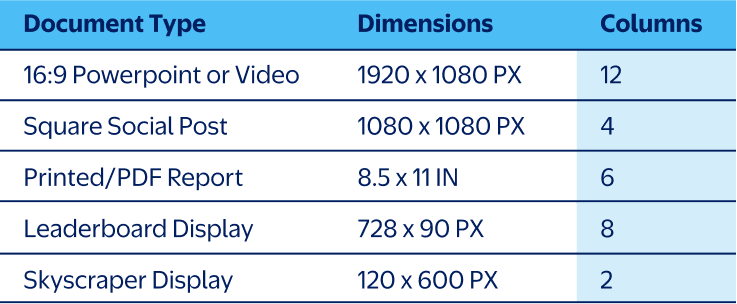
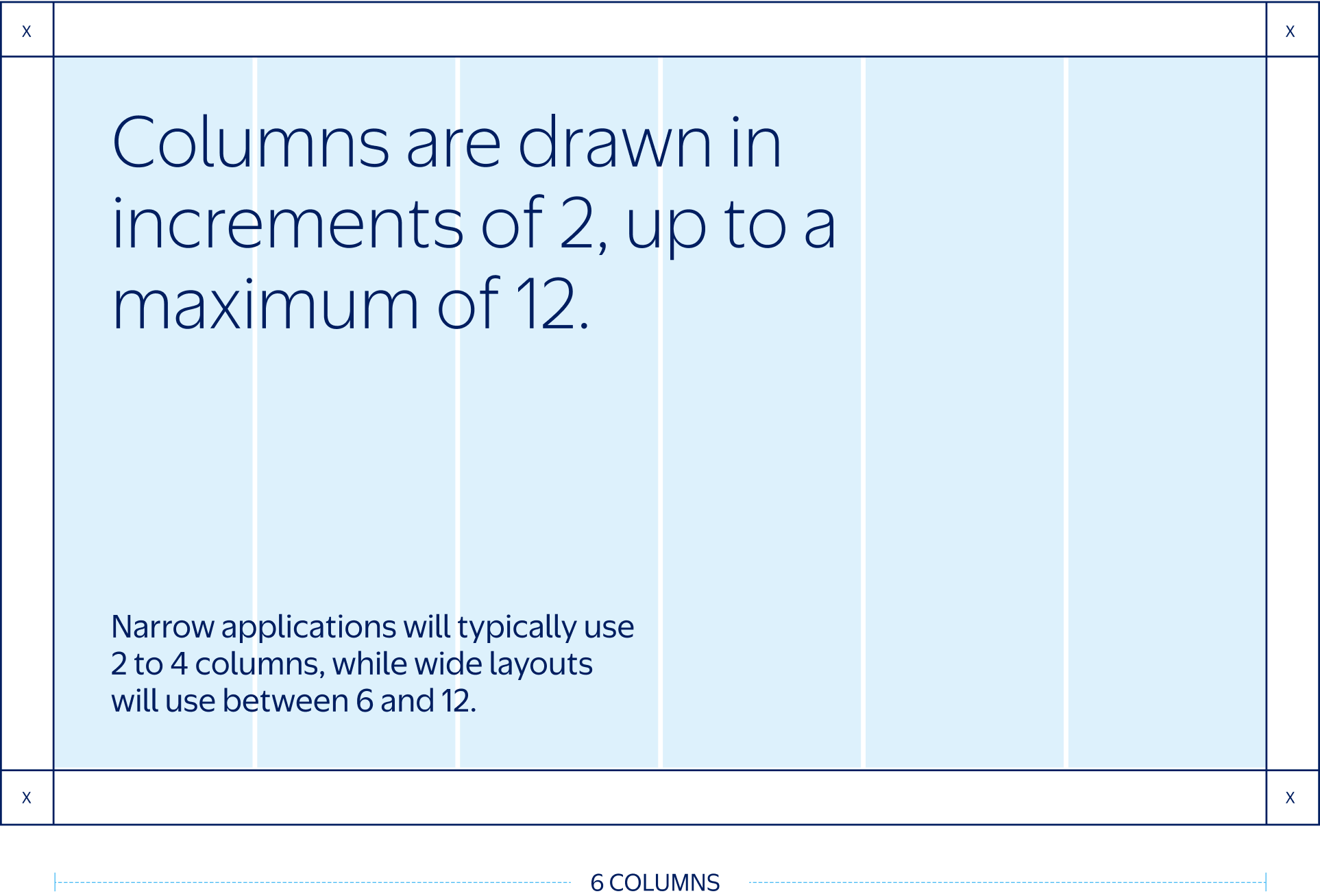
We divide the interior space into vertical columns to help organize our content. Columns are drawn in increments of two, based on the document’s width. Wider applications will need more columns, while narrow applications will need fewer.
Also consider the type of content that will occupy the space—complex information will require more columns to establish a clear hierarchy. See the table here for some common document sizes and sample column counts.
Gutters
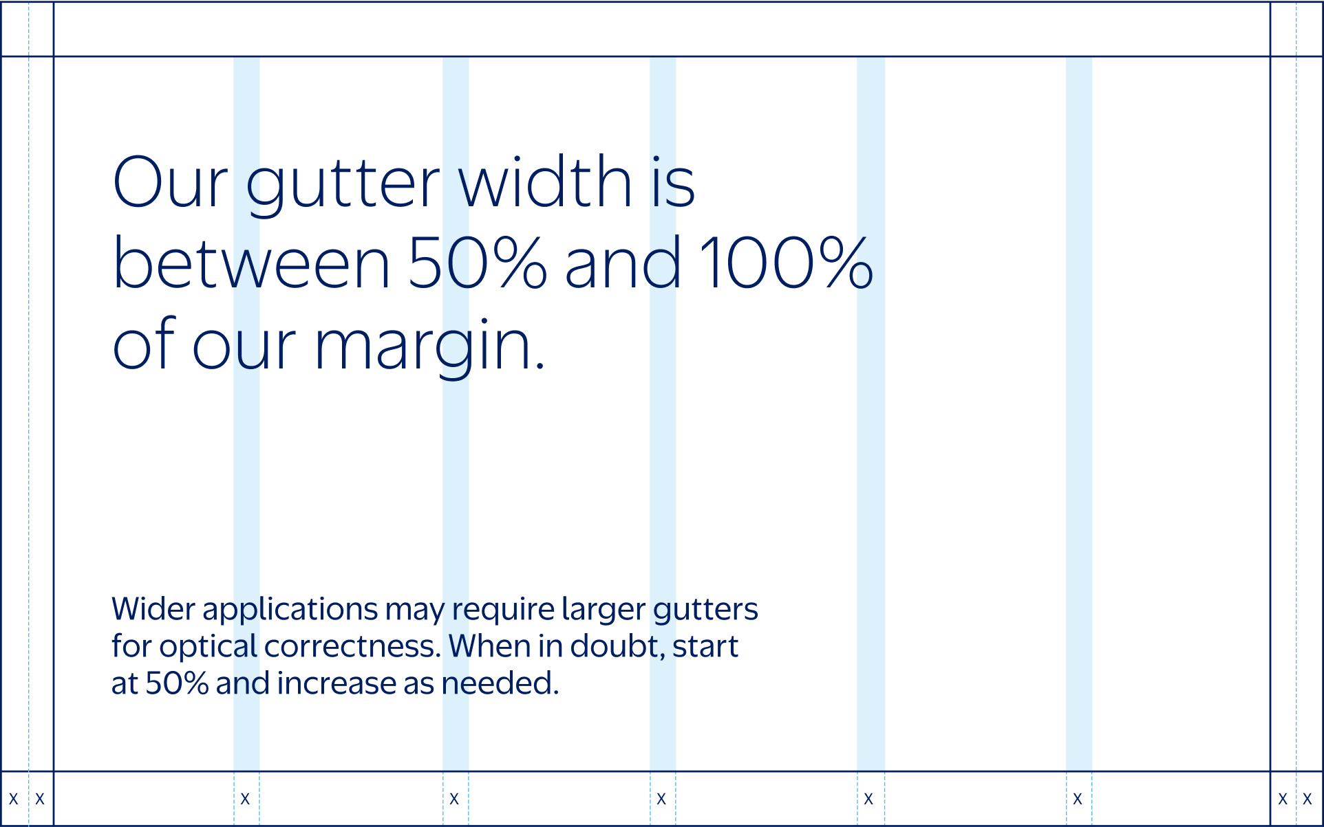
Gutters are the clear spaces between columns that separate text, images, and graphics. They make our communications tidy, organized, and legible.
The width of our gutters is determined in relation to our margin. Gutters should be between 50% and 100% of our margin width, depending on the size of the application. A 50% gutter is sufficient for most needs, but may be too thin for very wide layouts. Use your best judgment for spacing.
Optical Guide
Too Narrow
Just Right
Too Wide
Too Narrow
Just RIght
Too Wide
Applying Logos
After establishing a grid, our logos may be used.
Our wordmark and Spark are now decoupled from one another for more design flexibility. This section outlines the rules that govern their sizing and placement.
Proportions
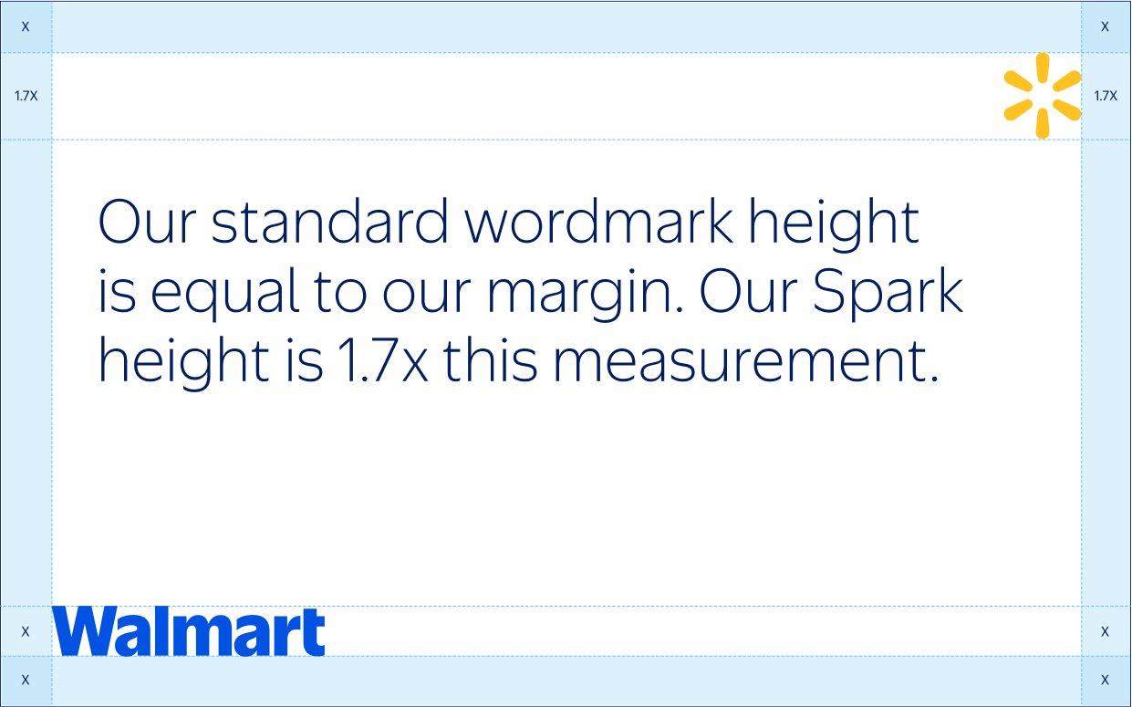
When our wordmark and Spark are used together in a layout, they always maintain the size relationship shown here. The four inner segments of our Spark should match the height of our wordmark, making the Spark approximately 1.7x our wordmark’s height.
This size relationship is fixed: the wordmark and Spark must always scale up or down as a set—never independently. Remember—our Spark and wordmark are separate logos. We do not lock them up together.

Scale
The height for our wordmark in layout is equal to the width of our margin. The height for our Spark is then 1.7x the margin height, according to the proportions above.
Use this as a baseline measurement—logo sizes can require optical adjustment, particularly on very wide or very tall layouts.
Remember
When resizing the wordmark, our Spark must also increase or decrease accordingly to maintain correct proportions.
Placement
Our wordmark and Spark are always located on opposite sides of a layout. Where possible, we place the wordmark in the lower left corner and the Spark in the upper right. If this isn’t possible, you can use one of our secondary placements. To help you remember these placements, keep in mind two simple rules:
1. Wordmark can't be at the top of a composition.
2. Wordmark can't be right-aligned.
Primary
1 Left-aligned Diagonal
Secondary
2 Left-aligned vertical
3 Baseline horizontal
4 Centered vertical
Alignment
Our wordmark always aligns precisely with the margins of our application. Our Spark can utilize one of two different alignment methods, depending on its relationship to our wordmark:
Flush
Our standard alignment, used in the majority of layouts, aligns the edge of the Spark flush with the edge of our margin.
Centered
When our Spark and wordmark are horizontal, we vertically center our logos so that the wordmark aligns with the Spark’s four inner sparklets. This means that the Spark may protrude into the margin.
Don'ts
When applying our logos, we always avoid the following misuses.
Don't align our wordmark to the right edge of a layout.
Don't align our wordmark to the top margin.
Don't alter the size relationship between our wordmark and Spark.
Don't create a lockup with our wordmark and Spark.
Applying Type
This section outlines our rules for consistent type layout to enhance brand recognition and clarity.
Placement
Our preferred headline placement is always in the upper left corner. If this placement doesn't work, you may use one of the flexible secondary placements shown below (in order of preference).
Always be mindful of leaving ample white space for our Spark. When the Spark is located in the upper right corner, we aim to keep the right column free from any headlines or subheads. If text must be placed in the same column, give a generous vertical buffer (roughly 1/3 of our document height).
Primary
1 Upper left corner
Secondary
2 Left-aligned to margin
3 Left-aligned to gutter
4 Centered
Scale
To maintain hierarchy, headlines should always be set larger than our wordmark. Aim for a contrast ratio of at least 3:2; in other words, our wordmark should be no larger than 2/3 of the headline size. We encourage using larger headlines for greater contrast when possible.
Not Enough Contrast
3:2 Contrast Ratio
Headline Don'ts
When setting headlines, we’re always mindful of the way our text interacts with our wordmark and Spark. Avoid the following misuses.
Don't set headling too small.
Don't let headline encroach on the Spark.
Don't right-align headline.
Don't let headline encroach on the Spark.
Layout Quick Guide
This section is our layout design cheat sheet. It’s a quick summary that walks through the step-by-step process of building a layout, from our initial grid to adding frames and photography.
Our quick guide only includes the most essential layout information. For more details on each element, see the previous sections.
Layout Guide
Applying Margins
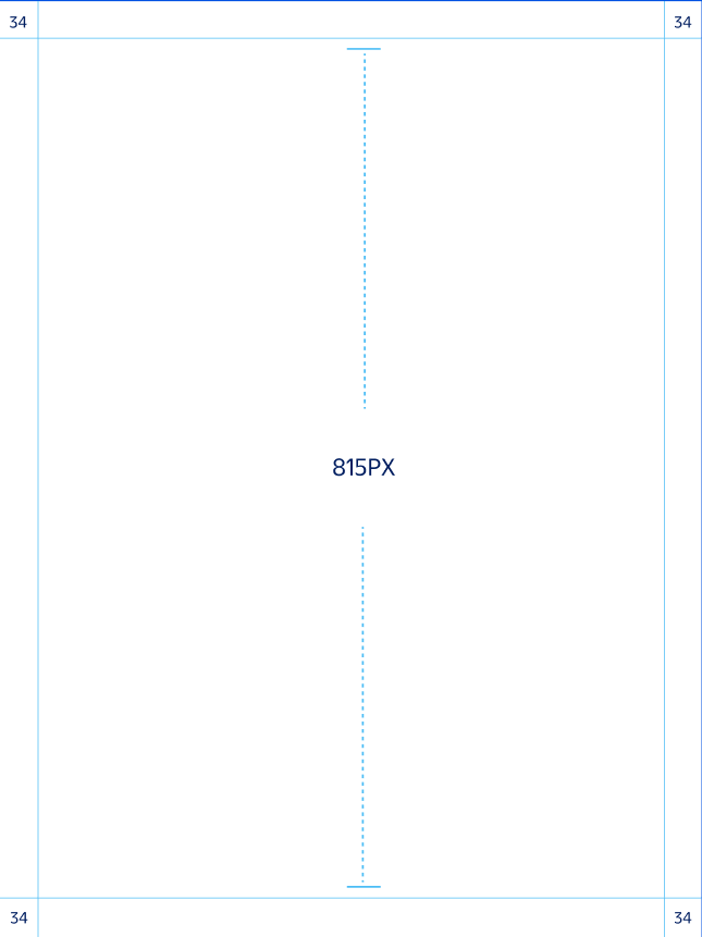
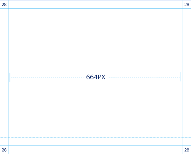
When designing a layout, our first step is to establish margins using the formula:
Long Side ÷ 24 = Margin
In the case of very wide or very tall layouts, margins may need to be slightly reduced for optical correctness.
1 815px H ÷ 24 = 34px Margin
2 664px W ÷ 24 = 28px Margin
3 664px W ÷ 24 = 28px Margin
1
2

3
Layout Guide
Applying Columns and Gutters
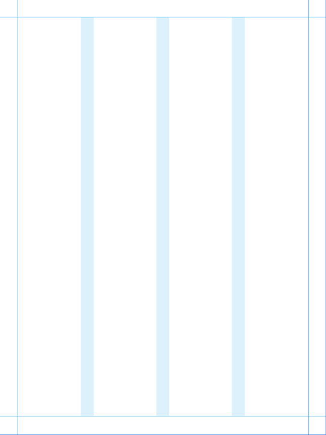
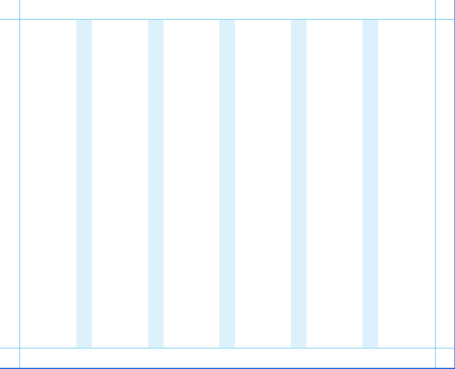
After setting our margins, we divide the page into columns and gutters to organize our content.
Columns are drawn in increments of 2, up to a maximum of 12 columns for our widest and most complex layouts. The width of our gutters may range from 50% to 100% of our margin, depending on your application.

Layout Guide
Applying Headlines
Our preferred headline placement is in the upper left corner. Headlines should be large and impactful, but they should never occupy the full width of an application—we aim to keep the last column free from text to reserve space for our Spark.
1
Short line lengths help keep our headlines large and impactful.
2
Longer line lengths may be used on wide horizontal layouts.
3
Leave the last column free from text to reserve space for our Spark.
1

2

3

Layout Guide
Applying Subheads
Subheads may be no larger than 50% of our headlineʼs cap height to ensure proper hierarchy.
We always encourage larger size differentiation for maximum contrast between levels of text.
1
We prefer to stack our subheads left-aligned beneath our headline.
2
In extra wide layouts, the subhead may rest along the bottom margin.
3
Minimum space between headline and subhead is 3/4 of the headline’s height.
1

2

3

Layout Guide
Applying Logos
Our preferred Spark placement is in the upper right corner, opposite to our wordmark in the lower left corner. This keeps all text (including our wordmark) left-aligned in a clean block for maximum clarity and simplicity.
The height of our wordmark is roughly equal to our margin. The Spark is 1.7x our wordmark height to maintain their size relationship.
1
Where possible, all text (including our wordmark) should be left-aligned.
2
In small layouts, our Spark may be used without our wordmark to save space.
3
Our Spark is always 1.7x the height of our wordmark.
1

2

3

Layout Guide
Adding Frames
When adding frames to a layout, our text and logos shift to accommodate this extra content. Our standard rules for sizing and placement still apply, but confined to a smaller page area.
For information on frames, see Brand OS
1
Leave clear space equal to our margin between frames and other content.
2
Logos may shift away from document edge to make space for frames.
3
Headlines and subheads scale as a unit to maintain their size relationship.
1

2

3

Layout Guide
Applying Full-Bleed Imagery
When using full-bleed imagery, headlines and subheads may be moved around our grid to best fit the available negative space. Exact placement is flexible, just be sure all text is left-aligned to a column. Size and placement rules for our logos do not change.
1
Text should be placed over a natural clear space in the image.
2
Text may be left-aligned to any column while leaving room for our Spark.
3
Our preferred headline placement is still the upper left corner, if possible.
1

2

3
