Color
Primary Palette
Our primary palette are the colors that are most instantly recognizable as Walmart: True Blue, Spark Yellow, and White.
True Blue

White

Spark Yellow
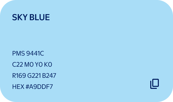
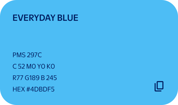
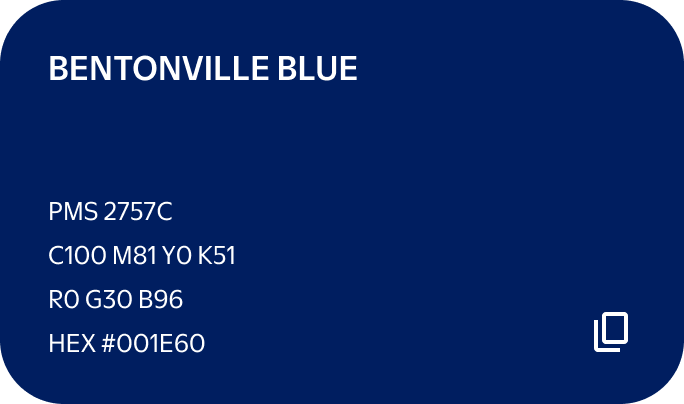
Our accent blues bring warmth and depth to our system. Bentonville Blue is used for typography, while Everyday Blue and Sky Blue help with hierarchy in presentations, graphs, infographics, and charts.


Color Pairings
When combining different pieces in a layout, we use the combos shown here for consistency and legibility.
Note
True Blue type is reserved for high-impact, low-content applications such as video end cards, supers, or signage. We don’t use True Blue for applications with small, dense, or detailed copy.
Solid Background
Over solid backgrounds, we prefer our iconic and recognizable colorways. These should be used for most communications.
Photography
Over photography, we default to using White type and White logos. In the case of photos with lighter backgrounds, our True Blue wordmark and yellow Spark may provide better contrast—please use your best judgment for legibility.


Waterfall
In some instances, we apply a waterfall treatment that organizes our secondary palette of blues (plus White) into a gradient. This treatment can be applied to help establish hierarchy when organizing information into charts, tables, or graphs.
Web Accessibility
The Web content Accessibility Guidelines (WCAG) are standards that help make the internet accessible to everyone, including people with disabilities. With color, they tell us the amount of visual contrast required between a piece of text and the background to maintain legibility for users with visual impairments.
When picking colors for web, we aim to comply with WcAG 2.0 standards for both large and normal text sizes. Large text is 14pt (18.66px) when set in a bold weight, or 18pt (24px) when set in a lighter weight. Any text beneath these sizes is considered normal text.
We always want to achieve a AAA rating, which is the highest possible compliance level (noted in green). True Blue text is not AAA compliant at small sizes and should be avoided.
Fully compliant
Partially compliant
Color Don'ts
Don’t use the wordmark in unapproved colors.
Don’t use the wordmark at partial opacity.
Don’t use low-contrast colors for the wordmark.
Don’t use text colors that inhibit legilbity.
Don’t use text colors that cause visual discomfort.
Don’t combine too many type colors in layout.
Don’t recolor individual sparklets.
Don’t use the Spark in unapproved colorways.
Don’t use a yellow Spark on low-contrast colors.